This is the first in a series of white papers published by KINDUZ Consulting on Statistical Analysis. This paper is an introduction to different data types and how to identify them. These concepts explained here lay the foundation for effective decision making.
[wpdm_package id=’11630′]
Context for the Reader
You are the Global Chief Executive of KINDUZ Corp., a global organization with revenue of USD 10 billion. The vision of KINDUZ is “Creating Universal Prosperity”. In line with its vision, KINDUZ has established itself in multiple industries including Pharmaceuticals, Oil, and Gas, IT/ITES, Automotive manufacturing and Cement industries.
You and your entire team believe that Creating Universal Prosperity is achieved through alignment of organizational goals to individual goals of stakeholders (Employees, Stockholders, Customers, and Societies).
Approach of the Whitepaper
This whitepaper is one in a series of whitepapers published by KINDUZ to enable deeper understanding and application of tools and techniques by CEOs enabling them to deliver sustainable outcomes.
The learning in the whitepaper is structured around cases, where the concepts and its applications are explained through the case description, analysis, and solutions.
Executive Summary
CEOs take important decisions about their organization based on the questions they ask, the data provided in response to these questions and the analysis of this data. Without an understanding behind the types of data, CEO’s may end up making wrong decisions.
This whitepaper explains the following categories of data:
- Nominal data (including dichotomous data)
- Ordinal data
- Normal Data
- Non-Normal Data

In God we trust. All others must bring data”
– W. Edward Deming
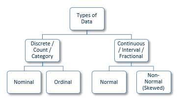
When organizing data for analysis, these are the most common categories that any data can be classified into. Nominal and Ordinal data is together known as Discrete, Count or Category data. Normal and Non-Normal data is together known as Continuous, Interval or Fractional data.
This paper provides examples of data types through the three cases which are based on delivery lead time variance of pharmaceutical products. The cases describe scenarios that a CEO may come across in day to day situations.
Based on these types of data, here is a list of Do’s and Don’ts for you to leverage:
Scenario
You, as the Global Chief Executive of KINDUZ Corp., meet Arthur, the CEO of KINDUZ Pharma over breakfast to discuss the challenges with respect to decrease in net profitability of KINDUZ Pharma by 8% over the past two years. During the discussion, you review multiple reports.
The three cases described below pertain to reports from Plant 1 (the largest of 7 manufacturing plants of KINDUZ Pharma accounting for 43% of the overall revenue) and specifically provide information for the top 6 products (A, B, C, D, E, F) by volume that account for 67% of total production volume at Plant 1.

Case 1
Case Description
One of the major concerns with the products listed above is the delivery lead time variance1 and Arthur has brought along a summary sheet with lead time variance of each product.
Following is the conversation between you and Arthur:
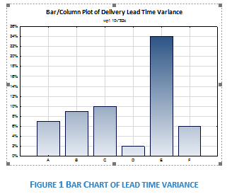
Arthur: There are 6 products at Plant 1 that contribute 67% to the total production volume. The average variance in delivery lead time for these 6 products is 10%.
You: So, what are we doing to reduce this variance in delivery lead time?
Arthur: Currently, we are focused on Product E and Product C to see how we can decrease the variation in the production processes.
You: Ok. What about the other four products?
Arthur: Well, the other four products have lead time variance of less than 10%. As Product E and Product C have the highest lead time variance, these are our current focus.
| Product | Delivery Lead Time Variance |
| Product A | 7% |
| Product B | 9% |
| Product C | 10% |
| Product D | 2% |
| Product E | 24% |
| Product F | 6% |
You: Oh, now I understand. I am glad that I asked about it otherwise I would have been under the assumption that all products have around 10% variance in delivery lead time. Looks like, Average in situations like this can be misleading.
Arthur: That is a fair point. But the average represents the variance for these products combined.
You: Right. But it may create an unintended perception as well. Like I thought that all products have an average lead time variation of 10%. Whereas one product has more than 20% lead time variation and one product has only 2% lead time variation. When the data is distributed like this, would it create the right perception if we take average across different products?
Case Analysis
In the data set above, the products are associated with the delivery lead time variance as a metric. The six products could also be quantified through other metrics such as production in tons, lead time variation and profitability.
When data sets are classified by labels (or groups) and have no inherent order, they are known as nominal data sets. Such data can be represented visually using a bar chart, pie chart or Pareto charts.
In case of nominal data, it is misleading to use average across different labels.
Now suppose, there were only two products being produced at the plant. Since there would be two labels, the data would still be nominal. However, in the scenario where there are only two groups, the data is said to be dichotomous (a sub-category of nominal data).
Case Decisions
When collecting data that is in labels which have no inherent order, classify the data as nominal and don’t take average across the categories. Even if you should calculate average across categories, show the category data to create intended perception
In such cases, data should be represented by using tools like bar chart, pie chart or Pareto chart, as shown below
Case 2
Case Description
Let us carry on with the conversation between yourself and Arthur:
You: Product E has a very high delivery lead time variance. How much product is currently on back order?
Arthur: Around 6.4 tones which is 30% of total orders we receive in a quarter.

You: That is indeed a cause for concern. What are we telling our customers?
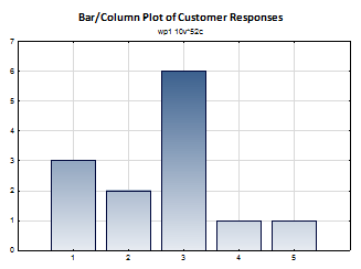
Arthur: We spoke to all customers of Product E. Basis their feedback we rated them on a scale of 1-5, on the likelihood of them cancelling their order.
You: Ok, and what were the results?
Arthur: On average, we got a rating of 2.6.
You: But what does that mean?
Arthur: Well, 2 means that the customers are not likely to cancel their order and 3 means that the customers are considering their options. So, 2.6 is somewhere in between that.
You: I am slightly confused. Can we have a look at the original survey data?
Arthur: Sure, why not? Here is the data
| Product | Delivery Lead Time Variance |
| 1 – Will not cancel the order | 3 |
| 2 – Unlikely to cancel the order | 2 |
| 3 – Considering their options | 6 |
| 4 – Likely to cancel their order | 1 |
| 5 – Will cancel the order within 15 days | 1 |
Case Analysis
In this case, there are values so we could in theory, calculate the average rating which would be 2.6. But what does the value of 2.6 mean? Data that has some form of order to it where we can confidently say one category to be better than the other is Ordinal data. We can’t take average for ordinal data because:
- We know what 2 represents and what 3 represents. But there is no meaningful value of 2.6 on this scale. Ordinal data cannot be broken down into smaller sub-units in a meaningful manner
- Additionally, we cannot quantify how much better or worse is one value on the ordinal scale when compared to the other. For example, we know that Option 1 (Will not cancel the order) is better for KINDUZ Pharma than Option 2 (Unlikely to cancel the order). But we cannot quantify how much better Option 1 is to Option 2
Case Decisions
- When dealing with categorized data where the categories have some inherent order, don’t use average across the categories. Instead, use the category with the highest frequency (mode) as a measure of central tendency2. In this case, the modal category would be 3 (considering their options)
- Like Nominal data (discussed in Case 1), visual tools to represent Ordinal data are bar chart, pie chart and Pareto Chart
Case 3
Case Description
You are now trying to identify where the delivery lead time can be reduced and the following conversation ensues:
You: So, looking at other products, if I remember correctly, Product C and Product E have almost the same process and we use the same supplier for both? Why is the variance of Product E so much higher than Product C?
Arthur: Last month some of the batches of Product E were delayed by more than 70% because of production challenges. That led to increase in the overall lead time.
You: But doesn’t it create an incorrect perception again? Why should the overall lead time be impacted because of increase in lead times of some of the batches? There should be a better representation of such data.
Arthur: That’s true. But we can’t report the variance for each batch so we used average instead.
You: Ok. So, the question is whether this type of data is accurately represented by taking average?
Case Analysis
Let us understand the case of Product C and E in detail.
The delivery lead time variance for the last 13 batches of Product C was:
3%, 1%, 5%, 0%, 2%, 2%, 1%, 2%, 0%, 3%, 4%, 2%, 1%
The average of the above values is 2%. There doesn’t seem to be any extreme values in this data. To cross-check, we can draw a histogram to represent the data.
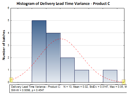
- If you observe the two ends (called ‘tails’) of the red line (called the ‘probability distribution’), then you will observe that the gap between the x-axis and the point where the red line touches both left and right y-axes do not have significant difference
- Also, the peak of the probability distribution is somewhere near the center of the x-axis
Such data where the values are clustered around the center and the distribution curve is almost symmetric is known as normally distributed data. In such a case, the average value is an accurate representation.
Looking at Product E now, the delivery lead times for the last 13 batches were:
3%, 4%, 5%, 0%, 2%, 2%, 4%, 2%, 1%, 71%, 75%, 72%, 71%
Looking at this data, notice that a lot of the values are like those of Product C. However, there are 4 batches where the variance is over 70%. Let us plot the above data using histogram:
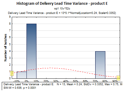
Data which contains extreme values that distorts the curve and makes the curve asymmetric about the middle is known as non-normal data. In these cases, using average can often be misleading. Instead, it is better to arrange the data in ascending or descending order and take the middle most value (median).
Case Decisions
- When data is clustered around the middle and tapers off to the sides in a symmetric manner, it is said to be normally distributed. In these cases, average (also called as mean) is a good representation of the data
- When the data has extreme values that skews the graph and makes it asymmetric, it is said to be a non-normal distribution. Most industrial data are non-normal and using median in these cases provides the right representation
- To identify whether data is normal or non-normal, a histogram can be used as a basic visual check
- Kindly note that an objective method to determine whether the data is normal or non-normal is by using a Normality test. We will discuss this test in detail in subsequent white papers
Conclusions
In this white paper, we looked at the different types of data and how to identify the kind of data we are looking at. Identifying data correctly is the first step to accurate statistical analysis. It is extremely common in the industry to identify data types incorrectly. This often leads to a distorted picture of the ground reality. In the next white paper, we will look at central tendencies in detail and which central tendency to use basis the type of data.
Appendix
This section presents the key notes from the white paper.
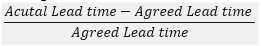
- Lead time variance is the variation from the agreed lead times with the customer. It is expressed as percentage and is calculated as
- Measure of Central Tendency – A measure of central tendency is a single value that describes the way in which a group of data cluster around a central value.